Scatter and Bars
Scatter
- In Pyplot, you can use the scatter() function to draw a scatter plot.
- This function plots, one dot for each observation. It requires two arrays of the same length i.e. x and y points
from matplotlib import pyplot as plt

x = [5,7,8,7,2,17,2,9,4,11,12,9,6]
y = [99,86,87,88,111,66,133,87,64,87,77,85,86]

plt.scatter(x, y)
plt.show()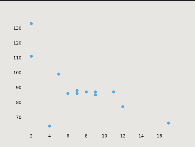
-
We can also compare two scatter plots:
from matplotlib import pyplot as plt

x = [5,7,8,7,2,17,2,9,4,11,12,9,6]
y = [99,86,87,88,111,66,133,87,64,87,77,85,86]
plt.scatter(x, y)

x1 = [3,4,8,2,13,5,23,9,7,6,10,11,20]
y1 = [89,98,78,87,65,56,46,79,80,43,87,54,88]
plt.scatter(x1, y1)
plt.show()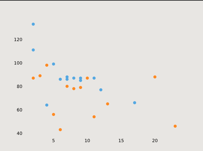
ColorMap
- You can define the colormap with the keyword argument cmap with the value of the colormap.
- Viridis is one of the built-in colormaps offered by Matplotlib.
- Additionally, you have to create an array with values (from 0 to 100), one value for each of the points in the scatter plot:
from matplotlib import pyplot as plt

x = [5,7,8,7,2,17,2,9,4,11,12,9,6]
y = [99,86,87,88,111,66,133,87,64,87,77,85,86]
color = [0, 10, 20, 30, 40, 45, 50, 55, 60, 70, 80, 90, 100]
plt.scatter(x, y, c=color,cmap='viridis')

plt.show()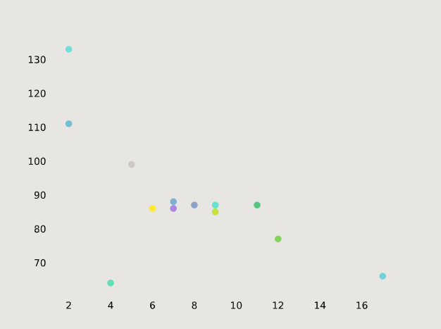
Bars
- We can us Bar() function to draw bar graphs in pyplot
import matplotlib.pyplot as plt

x = ['last', 'third', 'second', 'first']
y = [1, 2, 4, 6]
plt.bar(x,y)
plt.show()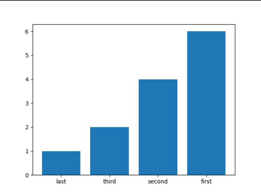
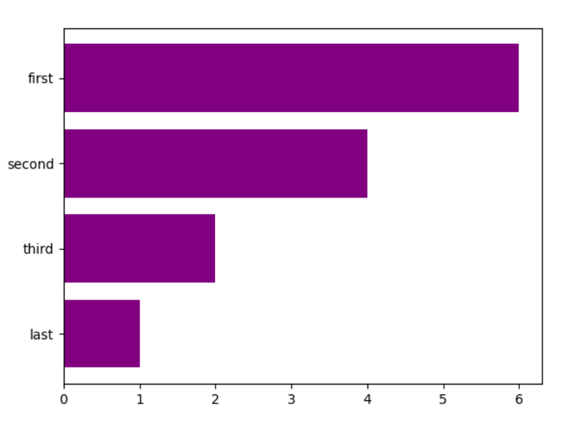
Horizontal Bars
- We can use the function barh(). If we want bars to be displayed horizontally instead of vertically.
import matplotlib.pyplot as plt
x = ['last', 'third', 'second', 'first']
y = [1, 2, 4, 6]
plt.barh(x,y)
plt.show()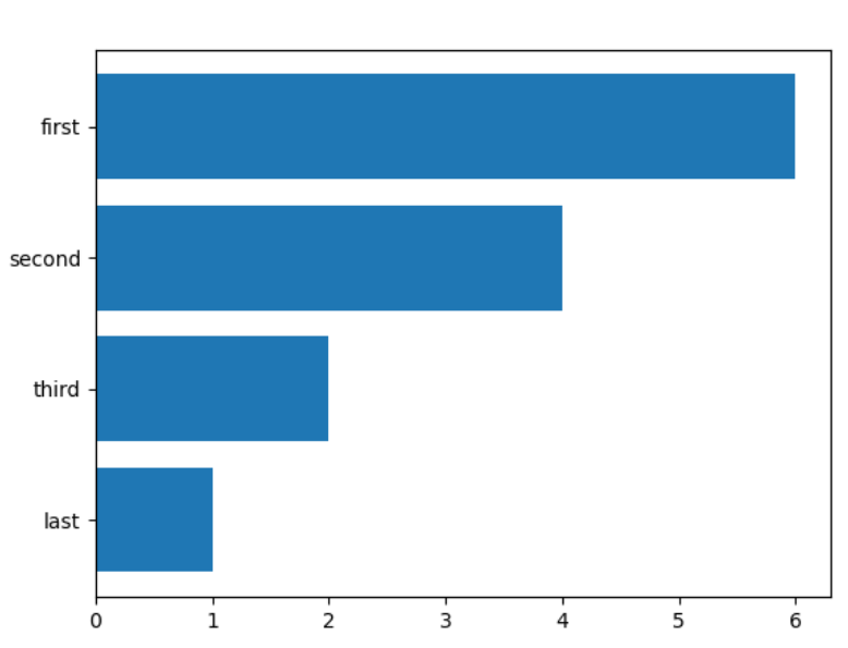
- We can also add colors to our Bar graph:
plt.barh(x,y,color='purple')
plt.show()